Billions of people check their emails daily. Keeping your messages recognizable and professional is one of the key ways to build a strong email marketing strategy and get noticed by your subscribers.
In our previous article, we told you about the most significant steps to keep brand consistency in email marketing strategies and the importance of design styles to acquire high-quality leads and leverage customer retention. Now, we will focus on the key aspects to keep in mind when developing a brand style guide for a top-notch email marketing campaign.
Build brand-consistent emails with our responsive templates
Top 6 aspects to consider when building an email style guide
Besides email marketing design trends, it’s vital to consider numerous aspects to establish a compelling brand style guide for your strategy. To make your life easier, we have compiled a list of six ways to keep your messages succinct and brand consistent:
1. Logo
Illustrative and well-designed logos reflect your business values, make a brand identity more consistent, and create a great first impression.
Incorporate your logo into an email template to make it noticeable. Place a logo in the email’s top left corner if you want to localize your messages for left-to-right languages. The header’s center is also a good option to go for.
Remember to keep your logo in the same spot every time to help recipients find and recognize it effortlessly.

(Source: Email from Atlas Obscura)
2. Fonts
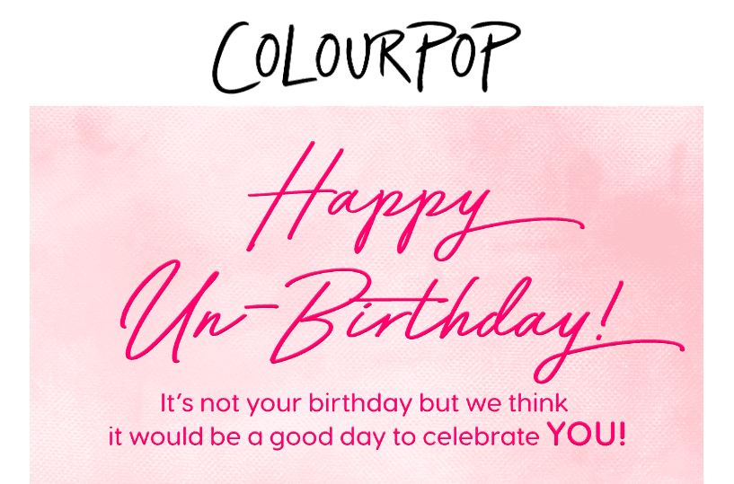
Keep your email fonts both legible and recognizable. Whether you prefer serif fonts or sans serif fonts for your email marketing strategy, make sure they are displayed correctly for your recipients.
If you feel tempted to incorporate a custom font to stand out, you have to remember that widespread email clients like Gmail, Outlook, and Apple Mail don’t always display them properly. In that case, your custom font will be replaced with a default one.
We recommend you use the font you use on your website to remain consistent and recognizable. Add the font name to your brand style guide and use it across all of your emails.
You should also specify the font styles and sizes for the following email elements:
-
headers (H1, H2, H3, etc.);
-
text for buttons;
-
text for descriptions in product cards;
-
signature;
-
footer.
(Source: Email from ColourPop Cosmetics)
3. Colors
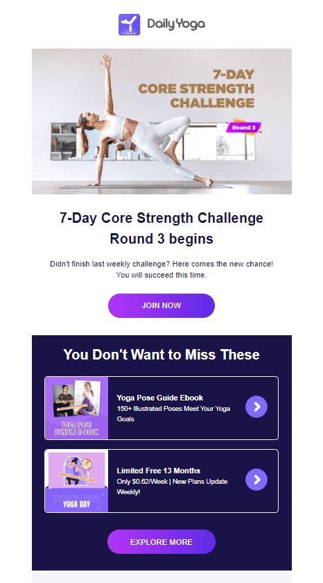
Being a crucial part of your company’s personality, colors can highlight your values and enable your emails to stand out among thousands of promotional messages in your subscribers’ inboxes. For example, red increases metabolism and makes you feel hungry (hello, McDonald’s and KFC), green can evoke the feeling of stability, and purple is associated with luxury.
We recommend you stick to your brand color scheme across all emails’ elements (icons, footers, CTA buttons, and backgrounds) and use imagery that matches your palette. Don’t forget to equip your brand style guide with codes of all colors and shades you use across your campaigns.
Define and save color codes for the next email elements:
(Source: Email from Daily Yoga)
4. Images
You can convey the key message much faster by using images in your email campaigns. If your email comprises statistics, charts, and graphs, it’s better to present them with an image for easier perception. With the help of visuals and interactive elements, you can also make your message more descriptive and trigger emotions.
Before adding an image to your email, think about the most suitable style for your company. Does your brand use vibrant illustrations? Or maybe you prefer to opt for black and white photographs?
Don’t forget to ensure every image is aligned with your email marketing strategy and other elements of an email — your logo, CTA buttons, and brand colors. For instance, if you usually use photos on your website and across your marketing channels, a newsletter with illustrations on a banner will interfere with your brand design styles.
If you use illustrations, it’s crucial to provide your designers with a color palette and font styles you chose to keep all of your images brand consistent.

(Source: Stripo Template)
5. CTAs
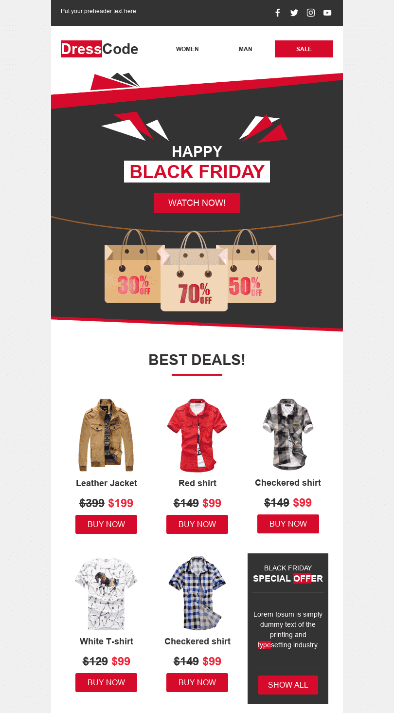
Now, give your subscribers a clear and straightforward reason to click. Make sure your CTA button matches corporate fonts and colors to stay brand consistent. Make your text action-focused to enable users to understand what they will acquire after clicking a button. Instead of fuzzy “Click here”, use more specific words like “Read”, “Get”, “Subscribe”, “Download”, or “Buy”. Center your button, ensure your font size is big and legible enough, and limit your CTA to three words.
It’s also great when buttons on your website and in newsletters look the same (design, colors, and effects). For example, if you use a button hover effect on your website, apply the same one to your emails.
(Source: Stripo Template)
Again, we want to recommend you stick to the color codes for the buttons and text on them your designer described in the “Fonts” and “Color” sections
6. Mobile styles
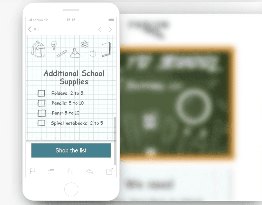
Did you know that seven out of ten users ignore emails that don’t display properly on mobile devices? Your messages may be brand-consistent and responsive on desktop but if they don’t appear correctly on smaller screens, you won’t catch users’ attention and increase conversions.
If you don’t want your messages to get ignored or deleted, ensure your email designs are mobile-friendly. Your color scheme and fonts will stay the same on desktop and mobile, but it’s vital to specify things like font size and button width for mobile devices.
Make sure to define the font size for:
-
headings (H1, H2, H3, etc.);
-
product card descriptions;
-
info on orders;
-
buttons;
-
signature;
-
footer.
(Source: Stripo Template)
Benefit from a powerful combination of a brand style guide and a modular system
In addition to brand guidelines, you can also benefit from modular architecture to save resources and simplify the design process. Whether you code your emails or build them in the drag-and-drop editor, our responsive modular system will help you follow the latest email marketing design trends and build eye-catching messages within minutes.
Your designer will have to develop the most suitable logo, fonts, colors, and visuals aligned with your brand identity and extract styles into CSS. Then, you can build a set of modular email templates for various purposes (a transactional email, a thank-you message, promotional content, etc.) and share them with email marketers.
As a result, your teammates can insert relevant content into these templates and put modules in different combinations according to your objectives. It will let you use modular templates across numerous email marketing campaigns and stay brand consistent.
Here are a few more benefits of using modular architecture for your business:
-
reusable interactive elements make it easier to follow the hottest email trends;
-
streamlined design process;
-
cost-effective alternative for multiple email campaigns;
-
hassle-free last-moment changes;
-
space for creativity and flexibility;
-
no coding skills are needed.
Take a look at Stripo’s modular email template divided into several editable blocks:
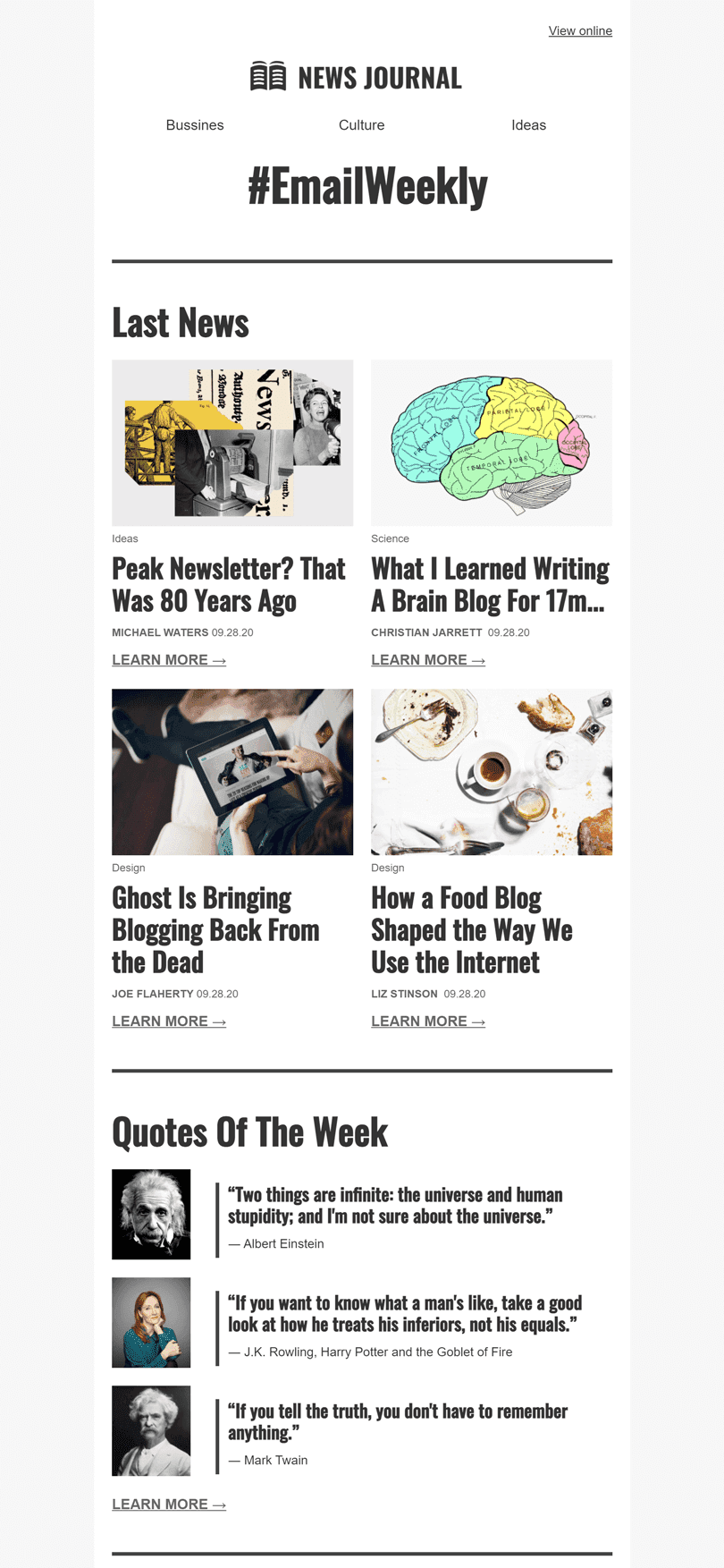
(Source: Stripo Template)
Wrapping up
A powerful mix of brand identity guidelines and modular email templates is a fantastic way to simplify the design process and make your messages memorable.
Your designers will have to develop an email style guide to differentiate you from other businesses. After that, email marketers can use these guidelines across multiple campaigns with the help of modular architecture.
By using convenient modules with interactive elements, your teammates can develop a set of editable templates for different purposes and rearrange them without compromising on brand consistency.
Check out Stripo to build your first branded email template right away