There are many well-designed custom law firm websites, but they’re hard to find since there are many more poorly designed ones out there. We spent some time browsing through hundreds of sites to see if we could pick out and share some of the best law firm websites on the internet to help you better understand how yours can help you attract, inform, and convert your clients.
Over the years, we’ve been successful in helping law firms grow their businesses, and we know what it takes to develop an effective website. We know all the elements that need to be added and executed throughout a law firm’s website to attract and retain more business. Therefore, although we could find attractive and well-designed sites, none were complete. To provide value for ourselves and our audience with whom we’re sharing these findings, we’ve shared the pros and cons of each site.
The Importance of a Well-Designed Law Firm Website
A well-designed law firm website is crucial today. It acts as your business’s online face and significantly affects how potential clients view your firm. A poorly designed site can mean lost opportunities, while a great one helps you stand out and attract more business with a custom law firm website design.
A vital benefit of a good attorney website is building trust with potential clients. A professional design gives off credibility, making visitors confident in choosing your services. An organized and informative site also allows better communication and engagement, fostering trust.
Responsiveness is vital, too. With many using mobile devices, your website must be optimized for all screen sizes. This improves user experience and boosts SEO, increasing your site’s visibility.
Lastly, user-friendly navigation is essential. Visitors should easily find the information they need without extensive searching. A well-organized site enhances user experience and boosts the chances of converting visitors into clients, even for small law firm websites.
Best Custom Law Firm Websites on the Internet
Law firms need websites that look good and effectively communicate their services, expertise, and brand. These eight custom law firm websites have been carefully selected based on their unique designs and functionalities, making them stand out.
1. Lindahl – Largest law firm in Stockholm, Sweden
lindahl.se/en
The Lindahl website is attractive because of its minimalist design. A clean, simple layout that works well, is responsive, and is user-friendly is used. However, as lovely as it looks, the downside is that the imagery doesn’t connect. The theme is appreciated because it relates to the tagline, but users might quickly leave thinking they’re not on the right site because the imagery doesn’t portray anything about the law. It’s also worth noting that some added imagery to the blog and knowledge center would help entice the audience into reading the articles.
Three other changes could improve the site even more besides the homepage. One would be adding an easier way to contact the firm by adding a form on the site. Also, drawing more attention to the practice areas and the knowledge center on the homepage would make it easier for the user to find the information that’s most important to them.
Lastly, testimonials should be added to the site. According to analytics, users contacting an attorney for the first time have two critical questions that must be answered first. Can this law firm handle my case? And, can they do it well? Listing the practice areas up front will answer the first question. Adding testimonials or reviews (or even a button that leads to the reviews on another site) would help answer the second question.
Overall, this is an excellent website because it’s a custom law firm website with a minimalist layout & the type of information they provide. Small changes such as updating the banner images, adding images to the Latest News pages, adding a form, and adding reviews would help make this site even better.
Pros:
- Clean & responsive layout
- Easy to read & navigate
- Well organized & uses a knowledge center which is convenient for first-time users
Cons:
- Imagery that connects better to what the firm does
- Add testimonials or reviews
- Add in a form or multiple forms on every page
2. Knutson + Casey – Hometown Attorneys in Mankato, Minnesota
knutsoncasey.com

There’s a lot to like about this website because of the richness of the bright color scheme, the different angles, the overlapping elements, and the various background patterns and images. These reasons make the site more enjoyable for the user to interact with. This website also offers many different, easy ways for users to contact them, which is convenient, so they don’t have to look for it.
However, as great as the site looks, some usability factors should be addressed. One of the most important factors would be the layout and user flow of the practice areas since they’re so important. To start, the practice area section on the homepage is too far down and doesn’t include any links or buttons to any mobile pages. Another issue is trying to find the area you’re looking for. It can be better organized, so the user doesn’t need to keep clicking to see what they need.
Lastly, the navigation could work because it is difficult to use on a desktop or mobile. It would make a big difference if it were better arranged and used in a different format. Also, adding some imagery would help the user connect better with the firm and become more familiar. The same imagery is used throughout the site, which could get boring, and the large headers make it hard to see that the page has changed because the headings aren’t in view (depending on your resolution).
Altogether, this website does check off the necessary elements except for a few. The practice areas and the navigation would be the most significant changes to upgrade the usability. An additional plus would be adding a Resources page to help guide and answer users’ questions and prepare them for what’s ahead.
Pros:
- Easy ways to contact
- Nice color scheme and use of patterns and overlapping elements on the homepage
- Good use of testimonials
Cons:
- Impossible to use mobile navigation
- Difficult to navigate practice areas
- No educational content (eBooks, FAQ’s, etc.)
3. Banks Law – Workers Comp Lawyer in Philadelphia, Pennsylvania
bankslaw.com
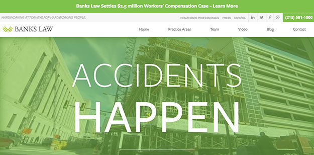
Banks Law’s website is enjoyable to look at and use because of its simple custom law firm websites. The homepage is arranged appropriately because it offers a guide under the main banner and then three videos leading to a video page. These two sections are great because they could quickly answer users’ questions. They also let the user know right away what type of law firm they are and the services they offer, which are very convenient.
The website isn’t overloaded with too much information, which makes it easy to navigate, but a bit more visuals would help, especially on the blog. More visuals of the firm give the user more insight and comfort by showing them the people they’d be sharing personal information with and where they would be meeting them ahead of time.
Additionally, adding more information about the attorneys and how to contact them individually would be beneficial. A user might want to contact an attorney directly instead of having the only option of contacting the whole firm.
Overall, this site uses a nice, clean layout and provides just enough resources for its users. Its usability is great, and it works well responsively. However, adding more visuals to connect the firm to its users better and providing more information to contact its attorneys directly could make this site more helpful to its users.
Pros:
- Simple, enjoyable layout and color scheme
- Educational material is offered upfront on the homepage to help any first-time users
- It has good usability and is responsive
Cons:
- More visuals are needed to help users connect better with the content and the firm
- It doesn’t allow users to contact team members directly, they have to go through the form on the contact or services pages
- It doesn’t have many reviews or testimonials so adding those could result in more people contacting them
4. George Gedulin – Criminal Defense Attorney in San Diego, California
gedulinlaw.com
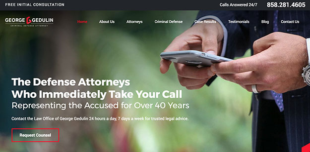
This website checks off almost all the necessary boxes for an excellent law firm website. However, the blog layout for this firm could’ve been designed better for bounce rate and usability. Their infinite scrolling doesn’t provide superb usability because it doesn’t give the user options, making it hard to access the footer if needed. It’s fantastic that they’ve added the secondary navigation on mobile because that makes it easier for the user to quickly find the important pages they’re most likely looking for.
Besides the blog, the homepage provides simple directions to the practice area pages and allows you to learn more about the firm. To make the homepage even better, some offers would help educate clients more about their cases while waiting to hear back. Cutting out most of the copy they’ve placed in the middle of the homepage would be beneficial since it’s too chunky and will likely turn users away from wanting to read all of it.
Overall, the best part of the custom law firm website is that it is easy to use but lacks imagery. There are no images on the blog, which could lower the bounce rate, and the copy is too heavy because there’s no imagery to balance it. This firm also doesn’t supply any educational resources to help answer the many questions a client might have while waiting for a consultation.
Pros:
- Usability is good, and the site is easy to use on mobile
- The testimonials are a great addition and give users more insight into the firm
- It’s easy to contact the law firm with a form being in the footer
Cons:
- More imagery is needed to help balance the vast amount of copy and to keep users interested
- There aren’t any educational resources to help users when they’re waiting for their consultation or waiting to hear back
- The blog needs a new layout because it’s hard to navigate with the infinite scrolling and it’s not very interesting to look at without any imagery
5. Price Law – Class Action & Trial Attorneys in Indianapolis, Indiana
price-law.com
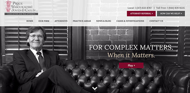
The overall look and branding of this website are well put together, but a couple of things could change. The first would be cleaning up the homepage by reducing the copy and removing any carousel and accordion content. Carousels aren’t the best practice because they require many clicks to reveal information. You’ll notice that there are three being used on the homepage.
The second change would be to remove the side navigation on the about and attorneys pages. Then, swap out some side navigations, like the one on the cases and investigations page, with a list of the services instead. Users should have easy access to the pages that mean the most to them, so ensuring the user flow is planned out for them is essential.
The last change would be to add resources throughout the site, especially on the homepage. Users looking for attorneys usually have many questions, so they must be offered resources to help educate themselves and make the best decisions.
Altogether, this site checks off almost all of the necessary elements. It does use best practices regarding layout, but it could use the small improvements mentioned above. The design must be updated but clean and not cluttered, which is good.
Pros:
- It is responsive and works well on mobile
- There’s either a form or a contact button on every page
- The services are well organized
Cons:
- Carousels and accordions are used for some of the content on the homepage and inner pages
- The color scheme could be updated since it looks a little outdated
- The content is too bulky and not balanced
6. Gunter Firm – Personal Injury & Employment Lawyer in Fort Myers & Naples, Florida
gunterfirm.com
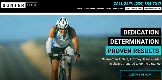
Users are drawn to this website because of the color scheme, and the website overall has updated styling and is appropriately responsive. It’s good that they dive into the services and FAQs on the homepage, but the personal banner photos don’t connect to what this firm does. The direction they tried with the tagline is excellent, but the individual images don’t connect well with their services, which could confuse the user.
Another concern about custom law firm websites is that they have two websites for employment law and personal injury. This could also confuse the user because the two sites are very similar but have different content, so they might think they’re still on the same site. It also took me a while to figure out that the two buttons that link the user to each site also act as a navigation bar. This provides poor usability because a button should never act as a button or a navigation bar. The mobile version of this is also hard to understand. A user would have to click “Employment Law” once, then open the navigation bar again and click “Employment Law” once more to get to that services menu.
Besides usability concerns, this website is well put together and provides users with the necessary information. It has updated design styling, it’s organized for the most part, and the information is easy to digest.
Pros:
Cons:
- Poor navigational usability especially by having two different websites
- The imagery on the homepage doesn’t connect the user well to what this law firm does
- Carousels are used which hinder usability
7. Bracewell – Law and Government Relations Firm in multiple locations internationally
bracewell.com
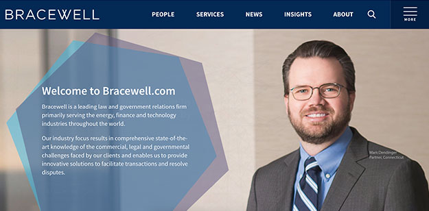
The best part of this site layout is its clean and uncluttered nature. Their knowledge center is appreciated because it can conveniently answer users’ questions and is on the homepage. One noticeable issue is that no contact form exists on any of the pages except the contact page. More conversions could occur if there is a contact form on the other pages, especially since the contact page link is hidden in the hamburger menu. It is also odd that there are two menus. They could’ve better organized their navigation so they wouldn’t have to have two menus.
Their services are organized well, so finding what a user wants is easy. They are listed and broken down by industry. There is also a PDF that can be downloaded for almost all areas, which can help users learn more about the type of trouble they might be in, which is incredible.
This site is well-structured and doesn’t need many improvements. The only major suggestions for improvements are making it easier for people to contact them and reorganizing the navigation bar.
Pros:
- A PDF about each of the services is included on almost every service page (it should open in a new window but doesn’t)
- The services are well organized and broken down by industry
- They have a resources center
Cons:
- Only a contact form on the contact page
- Two navigations are being used
- There aren’t any reviews or testimonials
8. Conroy Simberg – Premier Insurance Defense Firm, multiple locations in Florida
conroysimberg.com
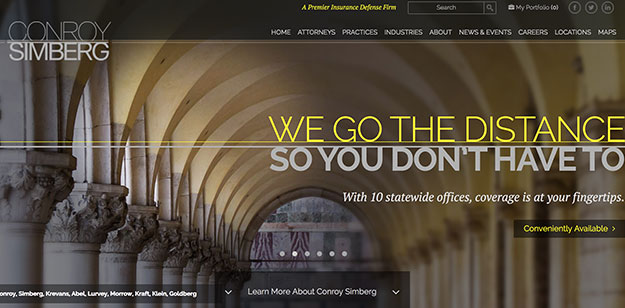
What we like most about this site is its design and organization. The layout makes finding the information a user might be looking for is easy. The practice areas are cleanly organized and categorized by industry as well. The things that could change, however, would be some user flow/usability, contact, and educational issues.
The general flow and usability aren’t inadequate, but they could improve. First, there are two buttons/links and a carousel in the header on the homepage. This provides too many directions for the user to take. Reviewing analytics and deciding on just one path the user should naturally want to take would guide them through the site how they’re supposed to.
Another clean-up aspect is the two accordions used on the homepage. Accordions are used where too much information needs to be organized or hidden. The accordions are being used here because they want to add much information on the homepage, but they need a way to disguise it all. The first problem with this is that an additional click needs to happen for the user to view the information, which is unnecessary. Secondly, the homepage copy should be more of a welcome greeting, so removing the copy and then adding a button will help guide the user to a page where the rest of the information for that topic is stored. This approach lets users decide which information they want to see and helps lower the bounce rate.
One of the last two issues is having an easier way for the user to contact the firm without having to call them. There aren’t any contact forms, just phone numbers and email addresses. Even though they have multiple offices, having a contact form somewhere would give users a more accessible option to contact them. Lastly, I would add some resources to help calm users of their issues by providing them with easy-to-understand educational materials. Resources are essential because people looking for an attorney are usually in some sort of panic. Having educational resources about their case could help ease their stress, help them understand, and prepare them better.
Pros:
- Great color scheme and design elements
- The practice areas are easy to find and are organized well
- Responsive & easy to use on mobile
Cons:
- There aren’t any contact forms
- No educational resources are provided
- There are too many paths for users to take on the homepage
Websites should continuously evolve and change with their users, so every site will always have negative and positive aspects. Plus, it’s important to note that any changes to a website should be based on that particular law firm’s audience. So, the suggested changes might not work for every site based on the user’s needs.
Our suggested changes are meant to inspire law firms to examine their users’ needs and ways of satisfying them.
Key Elements of Successful Law Firm Websites
When you analyze the top law sites, you will find certain key elements that they all share. These elements include professional imagery, easy navigation, and mobile responsiveness.
Do Highlight Practice Areas Prominently
One of the most crucial elements of a successful law firm website is prominently displaying their practice areas. This helps potential clients understand what services the firm offers and demonstrates the firm’s expertise and specialization in specific fields.
For example, Knutson + Casey lists its practice areas on its homepage, but they are tucked away in a small section at the bottom. This makes it less likely for users to see and click on them. Instead, they should be featured more prominently on the homepage, with clear navigation links or images representing each area.
Successful law firm websites often have a dedicated page or section showcasing their practice areas with detailed information about each one. This helps potential clients understand the firm’s expertise and improves search engine optimization and user experience. Additionally, including testimonials or case studies on these pages can further showcase the firm’s success and credibility in those practice areas.
Don’t Overlook Mobile Usability
A responsive website that is easy to use on mobile devices is crucial for any business. This is especially true for law firms, as potential clients often search for legal services on their phones or tablets.
Responsive design refers to a website’s ability to adapt and adjust its layout based on the size of the device it is being viewed on. This allows users to have a seamless experience regardless of whether they are accessing the site from a desktop computer or a mobile device.
However, some law firm websites still need help with mobile usability. For example, Lindahl’s website has navigation issues on mobile devices, with buttons and text overlapping.
Do Incorporate Educational Resources
Educational resources, such as videos and guides, can significantly enhance user engagement on law firm websites. Banks Law effectively incorporates these resources to educate potential clients about their services and legal processes.
Including educational materials on a law firm’s website shows their expertise and credibility in their field and helps potential clients better understand their case and how the firm can help them. This can increase trust and confidence in the firm, resulting in more conversions.
For example, Banks Law has a “Resources” section on its website with informative videos about various legal topics, such as personal injury cases or workers’ compensation claims. It also offers downloadable guides for users to reference at any time.
Lessons from the Best Custom Law Firm Websites
The best custom law firm websites have a balanced design that is visually appealing and easy to navigate. They highlight their practice areas, utilize mobile responsiveness, and incorporate educational resources to engage potential clients. These elements work together to create a complete package showcasing the firm’s expertise and credibility while providing valuable information for users.
To improve their websites, law firms should focus on creating a visually appealing design with clear calls-to-action and client-focused content. Practice areas should be showcased prominently, with dedicated pages or sections for each. Mobile usability should be noticed as more and more people are accessing websites from their phones. Incorporating educational resources can also enhance user engagement and showcase the firm’s expertise. By combining these elements, law firms can create a successful and effective website that caters to the needs of their audience.
Enhance Your Website with Professional Assistance
Is your website not attracting the traffic and leads you need? We can help. Contact us today to schedule a complimentary website redesign consultation. We’ll find the problem areas and provide practical and straightforward solutions to help your business grow.
FAQs:
Why would a law firm not have a website?
There are several reasons why a law firm may need a website. One factor could be limited resources, as building and maintaining a professional website can require time, effort, and money. Some law firms may also have concerns about complying with advertising rules and regulations set by their state bar association or governing body.
However, not having a website can significantly impact a law firm’s ability to attract clients and remain competitive in the digital age. With more people turning to the internet for information and services, online presence is crucial for businesses of all industries, including law firms.
Which site is best for law firms?
Law firms should consider customization, user-friendliness, and search engine optimization factors when choosing a website platform. Customization allows for the creation of a unique and professional design that accurately represents the firm’s brand and services. User-friendliness ensures potential clients and firm members can easily navigate the site and find the necessary information. Search engine optimization (SEO) provides that the website ranks high on search engines when users search for relevant keywords.
What does a law firm website need?
A law firm website should have the following key elements:
- Professional design: This includes a visually appealing layout with high-quality images and graphics that accurately represent the firm’s brand.
- Easy navigation: Users should be able to easily find what they are looking for on the site without getting lost or confused. Transparent menus, search functions, and calls to action can achieve this.
- Precise contact details: A law firm website must have accurate and up-to-date contact information, including phone numbers, email addresses, and physical addresses. This allows potential clients to contact the firm easily.
- Detailed practice area information: Every law firm website should have dedicated pages or sections for each practice area. This provides potential clients with valuable information about the firm’s expertise and services.
- Client testimonials: Including positive reviews and testimonials from previous clients can significantly enhance a law firm’s credibility and trustworthiness. This social proof can help convince potential clients to choose the firm for their legal needs.
Should law firms be on Instagram?
While Instagram may not be the first platform that comes to mind for law firms, it can offer valuable benefits when used strategically. With over 1 billion active users, Instagram is a highly popular social media platform that allows businesses to reach a younger and more visually-focused audience.
Is it unethical for law firms to market services on web pages and blogs?
In general, it is okay for law firms to market their services on web pages and blogs. However, these marketing efforts must adhere to ethical guidelines set by bar associations. These guidelines often require transparency, disclaimers, and protection of clients.
What legal pages does a website need?
A law firm website should have the following essential pages:
- Homepage: The main landing page introduces visitors to the firm and its services, with a brief overview of its history, values, and team.
- About page: Offers detailed information about the firm’s mission, vision, and team biographies and highlights any awards or recognitions.
- Practice areas: Each area has a dedicated section, allowing potential clients to learn about the firm’s expertise in specific legal fields.
- Contact page: This page includes up-to-date contact information, such as phone numbers, email addresses, and physical addresses, plus a contact form for inquiries.
- Legal disclaimers protect the firm from liability for misleading or inaccurate information and clarify the limitations of legal advice on the site.
- Privacy policy: Details how the firm collects, uses, and protects personal information from website visitors, ensuring transparency and legal compliance.
Source link
#Examples #Custom #Law #Firm #Websites #Oyova
