Believe it or not, chart price patterns really work. Not all of them, just a specific set of patterns, have proven to be reliable and profitable over time.
Research shows that the most reliable chart patterns are the Head and Shoulders, with an 89% success rate, the Double Bottom (88%), and the Triple Bottom and Descending Triangle (87%).
The Rectangle Top is the most profitable, with an average win of 51%, followed by the Rectangle Bottom with 48%.
These patterns are formed by the movement of stock prices on a chart, and they can provide valuable insights into future price movements.
Chart Pattern Reliability & Profitability Results
This table shows the chart pattern success rate/probability of a price increase in a bull market and the average price increase after emerging from the pattern. For example, the inverse head and shoulders pattern has an 89% chance of success when the price moves up through the resistance level, and the average gain is 45%.
Performance Data Courtesy of thepatternsite.com permission granted by Tom Bulkowski. *Figures for a downward break through the support line – bearish trade.
Identifying Chart Patterns
Traditionally, identifying chart patterns on a stock chart, drawing trendlines, and plotting target prices required manual effort. However, with the advent of TradingView, most chart patterns can now be automatically detected, streamlining the analysis process for professionals. TradingView is the number one charting service in the world and is loved by Liberated Stock Trader readers.
We independently research and recommend the best products. We also work with partners to negotiate discounts for you and may earn a small fee through our links.
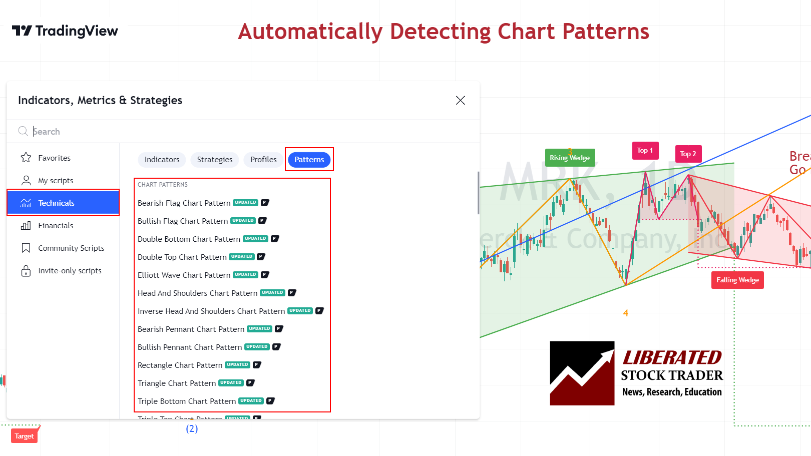
Get TradingView Chart Pattern Recognition
inverse head-and-shoulders stock chart pattern has an 89% success rate for reversing an existing downtrend. With an average price increase of 45%, it is one of the most reliable chart patterns.
The inverse head-and-shoulders pattern occurs when the price of a security hits the bottom three times, with two troughs forming the “shoulders” and the third lower trough forming the “head.” This pattern can indicate that the security’s price could soon begin to move higher.
| Chart Pattern | Success Rate | Average Price Change |
| Inverse Head and Shoulders | 89% | +45% |
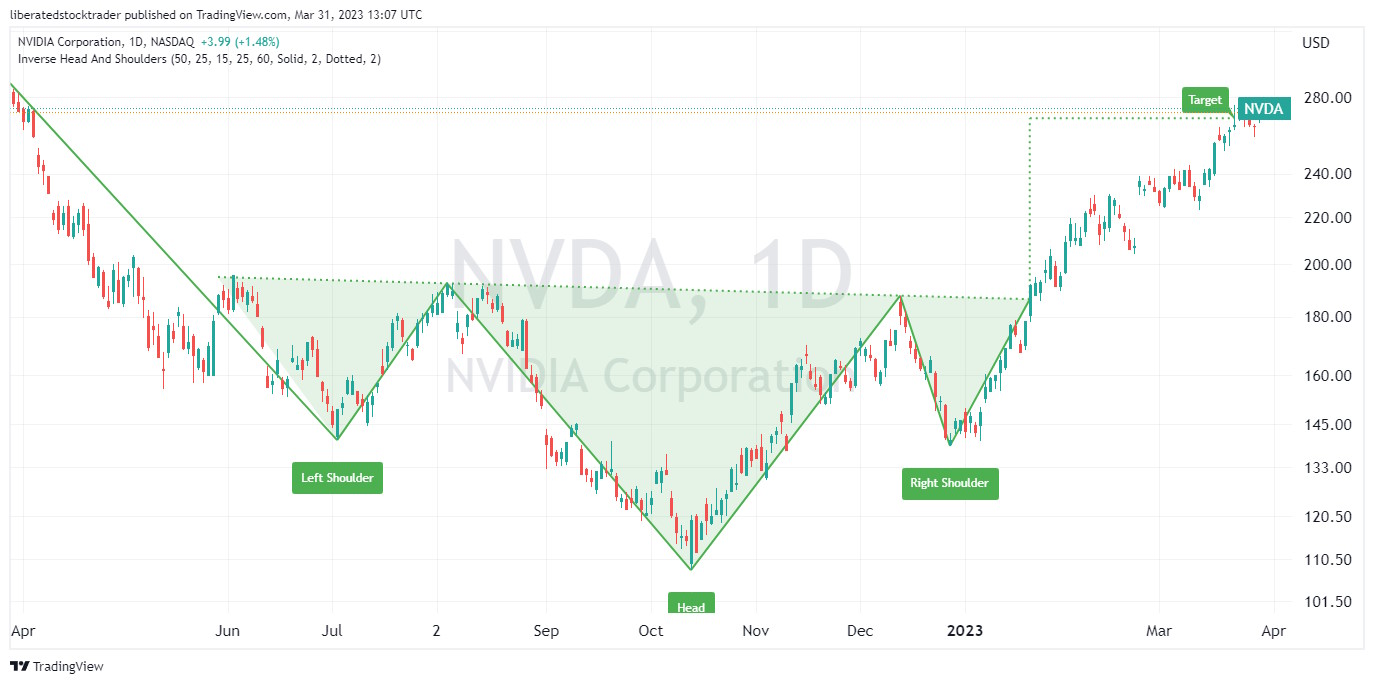
Auto-detect this Chart Pattern with TradingView
Identifying an Inverse Head and Shoulders
To identify an inverse head and shoulders pattern, look for three distinct lows in the security’s price on intraday, daily, and weekly charts. The middle low (head) should be significantly lower than the other shoulders. Look for a confirmation of a trend reversal by watching for a breakout either above the upper resistance line or below the lower support line.
If the security price breaks out above the resistance line, it could signal that the security has completed its reversal. In contrast, a break below the support line could signal a resumption of the downtrend.
Our original trading research is powered by TrendSpider. As a certified market analyst, I use its state-of-the-art AI automation to recognize and test chart patterns and indicators for reliability and profitability.
![]()
✔ AI-Powered Automated Chart Analysis: Turns data into tradable insights.
✔ Point-and-Click Backtesting: Tests any indicator, pattern, or strategy in seconds.
✔ Never Miss an Opportunity: Turn backtested strategies into auto-trading bots.
Don’t guess if your trading strategy works; know it with TrendSpider.
Unleash TrendSpider
double-bottom chart pattern has an 88% success rate on a reversal of an existing downtrend. When the price breaks through resistance, it has an average 50% price increase; the only pattern better than this is a cup and handle.
The double bottom occurs when the security price hits the bottom twice, creating a “W”-shaped pattern. This pattern often indicates that the stock’s price could soon increase. However, it should be noted that this indicator does not guarantee a reversal in direction.
| Chart Pattern | Success Rate | Average Price Change |
| Double Bottom | 88% | 50% |
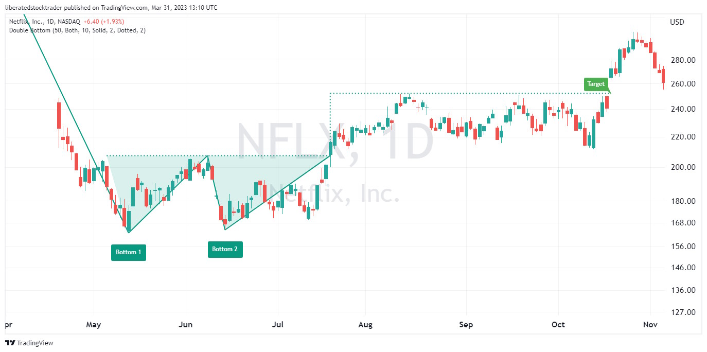
Auto-detect this Chart Pattern with TradingView
Identifying a Double-Bottom
To identify a double bottom chart pattern, investors should look for two distinct lows in the security’s price that form a “W”-shaped pattern. Generally, the pattern should be visible on an intraday and daily chart. After identifying the two bottoms, investors can look for a confirmation of a trend reversal by watching for a breakout either above the upper resistance line or below the lower support line.
If the security price breaks out above the resistance line, it could signal that the security has completed its reversal. In contrast, a break below the support line could signal a resumption of the downtrend. It should be noted that further confirmation of this stock chart pattern should not be relied upon until after prices have moved beyond these levels.
triple bottom chart pattern indicates the potential for a reversal of an existing downtrend with an 87% probability of success and an average 45% price increase.
A triple bottom occurs when the price hits the bottom three times, creating a “VVV”-shaped pattern. This pattern often indicates that the asset price could soon begin to increase.
| Chart Pattern | Success Rate | Average Price Change |
| Triple Bottom | 87% | 45% |
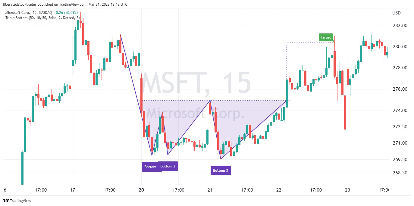
Identifying a Triple Bottom
To identify this stock chart pattern, investors should look for three distinct lows in the security’s price that form a “WV”-shaped pattern. The pattern should generally be visible on a daily and weekly chart. After identifying the three bottoms, investors can look for confirmation of a trend reversal by watching for a breakout either above the upper resistance line or below the lower support line.
If the security price breaks out above the resistance line, it could signal that the security has completed its reversal. In contrast, a break below the support line could signal a resumption of the downtrend.
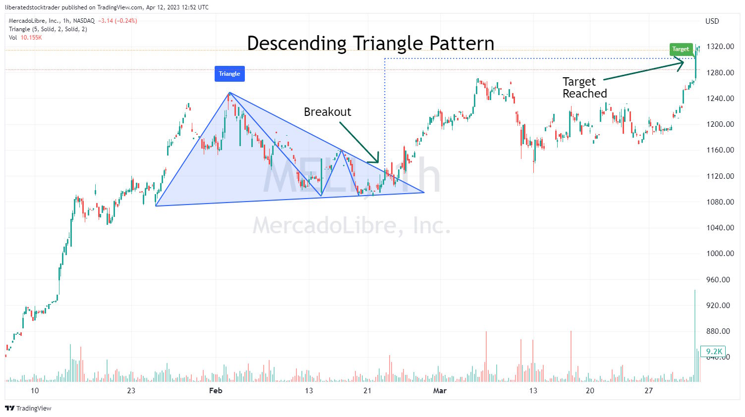
descending triangle chart pattern highlights the potential for a reversal or continuation of an existing downtrend. When the price breaks up through resistance, there is an 87% chance of success, with an average profit of 38%.
A descending triangle occurs when the price forms two downward-sloping trendlines that converge towards each other, creating a triangle-shaped pattern pointing downwards. This pattern can indicate that the security’s price could soon begin to move higher.
| Chart Pattern | Success Rate | Average Price Change |
| Descending Triangle | 87% | 38% |
Auto-detect this Chart Pattern with TradingView
Identifying a Descending Triangle
To identify a Descending Triangle chart pattern, investors should look for two downward-sloping trendlines that form a descending triangle. The pattern should generally be visible on intraday and daily charts.
After identifying the two trendlines, investors can look for a confirmation of a trend reversal by watching for a breakout either above the upper resistance line or below the lower support line. If the security price breaks out above the resistance line, it could signal that the downtrend is now over, while a break below the support line could signal the continuation of the trend.
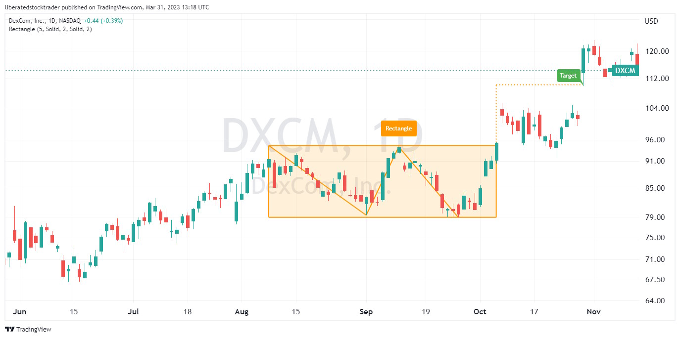
rectangular top chart pattern suggests a period of consolidation in the stock price; when the price breaks up during a bull market, there is an 85% success rate, with a 51% profit potential.
A rectangle top occurs when a security’s price is confined between two generally parallel and horizontal trendlines, which indicates that support and resistance levels at similar prices have been found. This typically occurs after an uptrend, as investors become less aggressive in bidding the price up. A rectangular top pattern can signify that the upward trend may soon end and could be followed by a sharp decline. The pattern is sometimes called a trading range, flat top, or rectangular formation.
| Chart Pattern | Success Rate | Average Price Change |
| Rectangle Top | 85% | 51% |
Identifying a Rectangle top
To identify a rectangle top chart pattern, investors should look for two parallel and horizontal lines forming a rectangle. Generally, the pattern should be visible on an intraday and daily chart. The upper resistance line should identify when the security’s price struggles to move higher, and the lower support line should identify when the security’s price fails to decline further. Once these two lines have been identified, investors can look for a breakout either above the upper resistance line or below the lower support line.
If the security price breaks above the upper trendline, it could signal that the security is resuming its uptrend. In contrast, a break below the lower trendline could signal a potential downtrend.
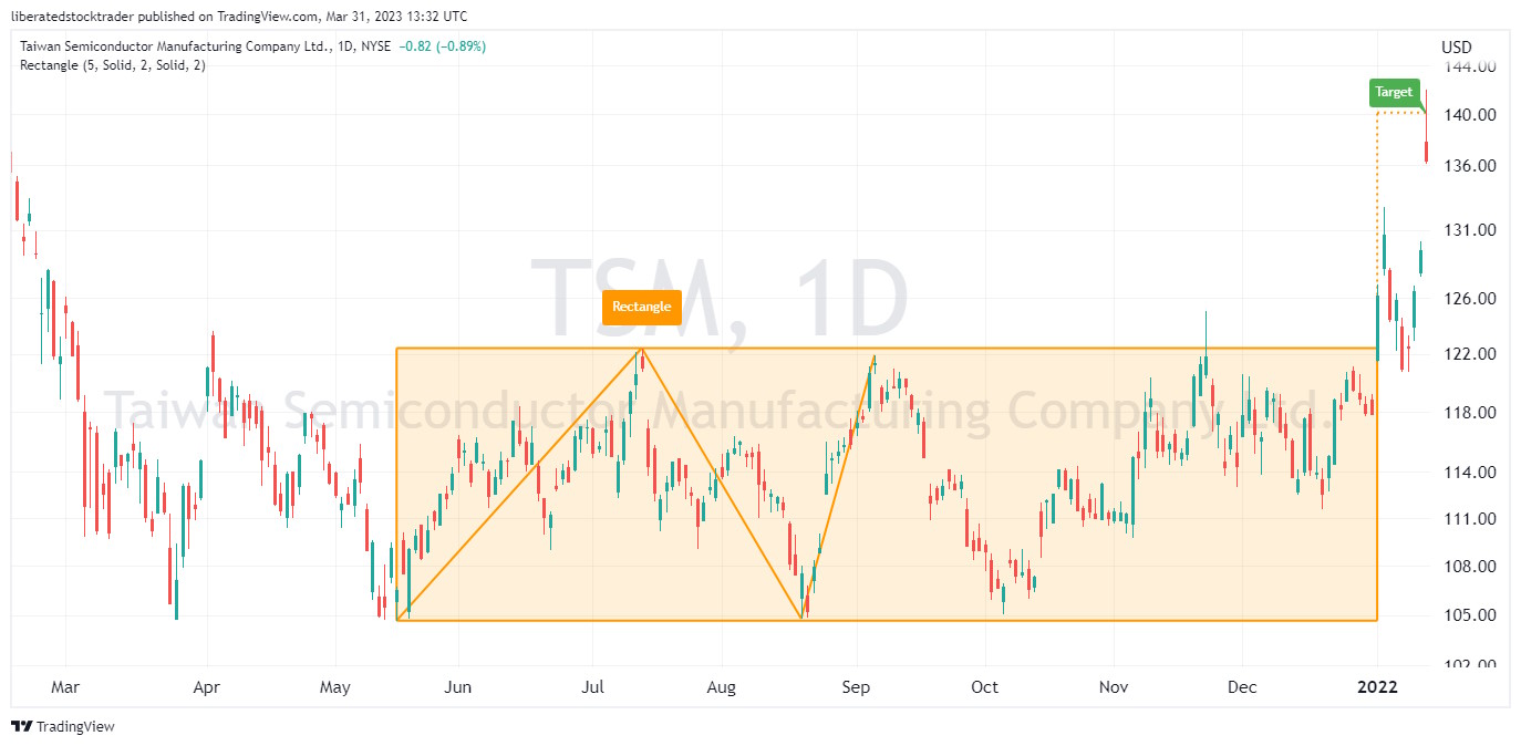
rectangle bottom pattern occurs when the price consolidates at the bottom of a downtrend, creating a “www”-shaped pattern. This pattern can indicate that the security’s price could soon begin to move higher or lower depending on the direction of the breakout.
| Chart Pattern | Success Rate | Average Price Change |
| Rectangle Bottom | 85% | 48% |
Get Chart Pattern Recognition with TradingView
Identifying a Rectangle Bottom
Investors should look for at least four bounces off the support and resistance lines to identify this stock chart pattern. The pattern should generally be visible on an intraday and daily chart.
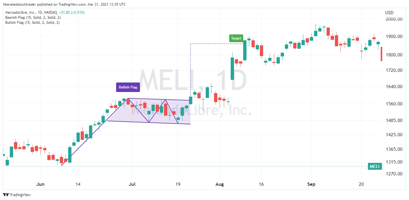
bull flag chart pattern suggests the potential for a continuation or reversal of an existing uptrend. When the price breaks out through resistance, there is an 85% probability of success with an average of 39% profit.
It occurs when the price of a security makes a quick and sharp rise, followed by a period of consolidation in which prices consolidate within two parallel trendlines. This pattern can indicate that the security’s price could soon begin to move higher or lower depending on the direction of the breakout.
| Chart Pattern | Success Rate | Average Price Change |
| High Tight Bull Flag | 85% | 39% |
Identifying a High-Tight Bull Flag
To identify a high tight bull flag pattern, investors should look for a sharp price rise followed by two parallel trendlines that form an ascending triangle. Generally, the pattern should be visible on intraday and daily charts. After identifying the two trendlines, investors can look for a confirmation of a trend reversal by watching for a breakout either above the upper resistance line or below the lower support line.
If the security price breaks out above the resistance line, it could signal that the security resumed its uptrend, while a break below the support line could signal a downtrend.
ascending triangle, there is an 83% chance of a successful trade with an average price increase of 43%.
It is important to note that ascending triangles can be either continuation or reversal patterns, depending on the direction of the prior trend. If the market was in an uptrend before the triangle formed, then a break above the upper trendline is likely to lead to prices continuing in the direction of the prior trend. Similarly, if the market was in a downtrend before forming an ascending triangle, a break below the lower trendline could signal a continuation.
| Chart Pattern | Success Rate | Average Price Change |
| Ascending Triangle | 83% | 43% |
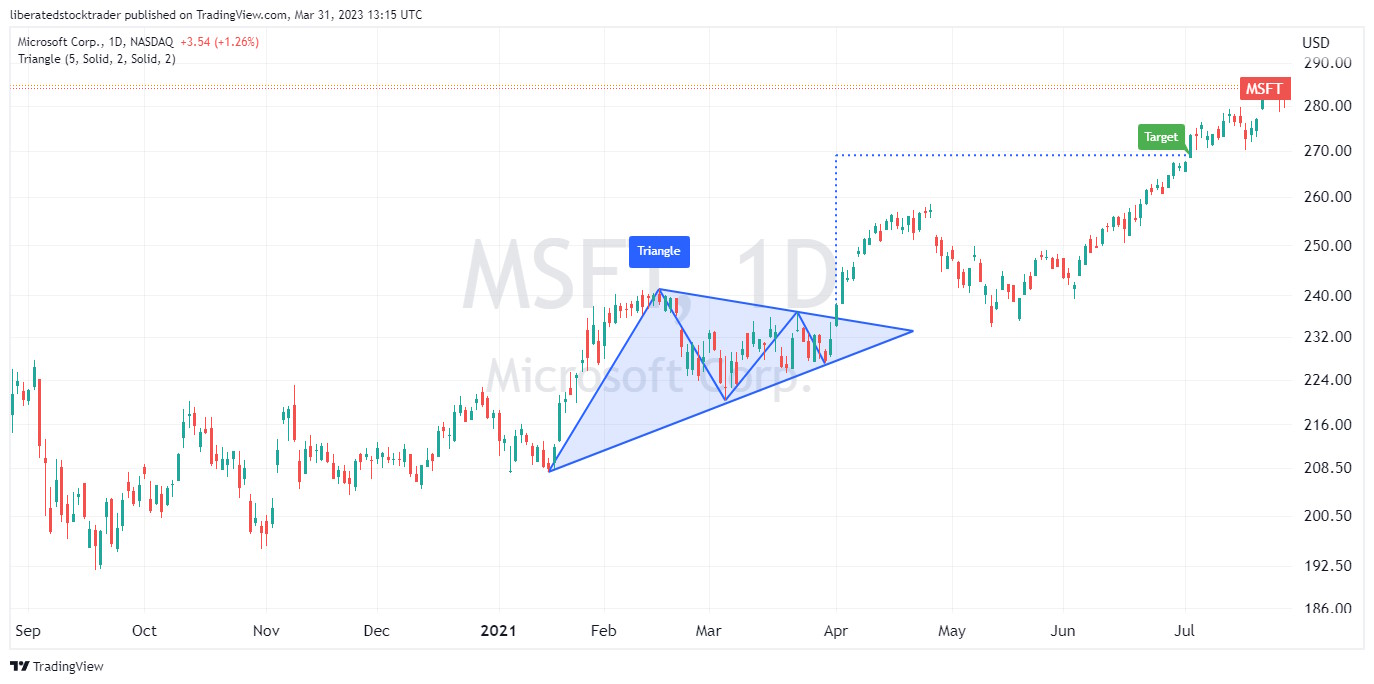
Chart Pattern Auto-Detected with TradingView
Identifying an ascending triangle
The ascending triangle is formed when an upward-sloping support line and a flat resistance line create a triangle shape with its apex pointing upwards. By watching for breakouts either above or below these lines, investors can gain insight into whether or not prices will continue their current trend or reverse direction.
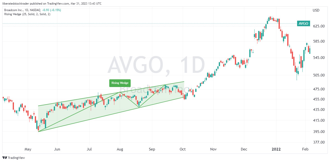
Rising Wedge chart pattern suggests an average success rate of 81% during a resistance breakout during a bull market, with an average 38% price increase.
A Rising Wedge occurs when the price of security forms two upward-sloping trendlines that converge toward each other, creating a wedge-shaped pattern pointing upwards. This pattern can indicate that the security’s price could soon begin to move lower.
| Chart Pattern | Success Rate | Average Price Change |
| Rising Wedge | 81% | 38% |
Identifying a Rising Wedge
To identify this stock chart pattern, investors should look for two upward-sloping trendlines that form an ascending triangle. Generally, the pattern should be visible in intraday and daily charts. After identifying the two trendlines, investors can look for a confirmation of a trend reversal by watching for a breakout either above the upper resistance line or below the lower support line.
If the security price breaks out above the resistance line, it could signal that the uptrend is continuing, while a break below the support line could signal a reversal of the trend and that prices are likely to move lower.
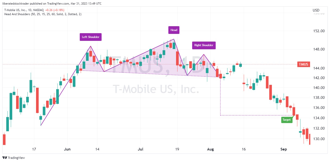
head and shoulders top occurs when the asset price peaks three separate times, with two peaks forming the “shoulders” and the third higher peak forming the “head.” This pattern can indicate that the security’s price could soon begin to move lower.
| Chart Pattern | Success Rate | Average Price Change |
| Head & Shoulders Top | 81% | -16% |
Auto-detect this Chart Pattern with TradingView
Identifying a Head & Shoulders Top
To identify this stock chart pattern, investors should look for three distinct peaks in the security’s price that form a head-and-shoulders pattern on intraday, daily, and weekly charts. After identifying the three peaks, investors can look for confirmation of a trend reversal by watching for a breakout either above the upper resistance line or below the lower support line.
If the security price breaks out below the support line, it could signal that the security has completed its reversal. In contrast, a break above the resistance line could signal a resumption of the uptrend. It should be noted that further confirmation of this stock chart pattern should not be relied upon until after prices have moved beyond these levels.
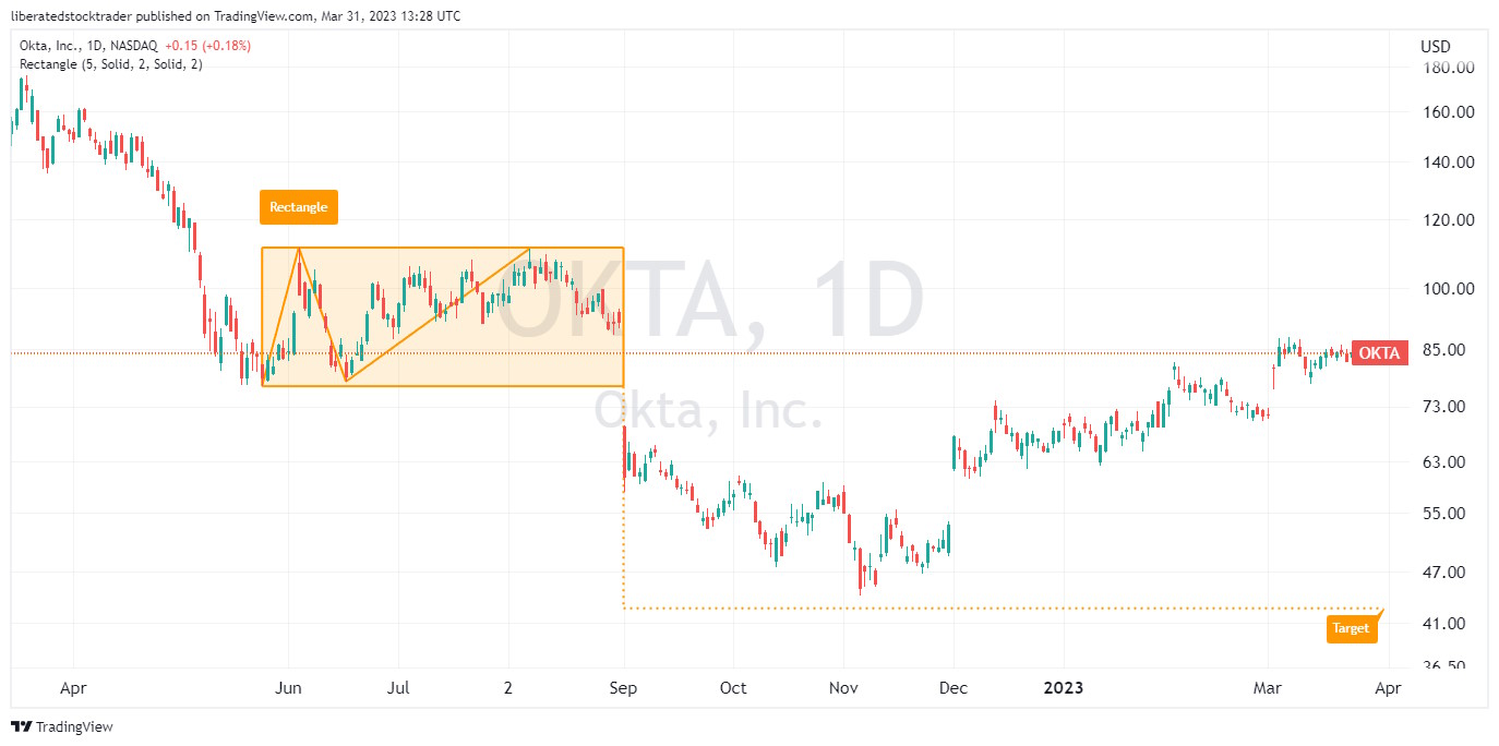
bearish rectangle bottom chart pattern with a downward breakout indicates the continuation of an existing downtrend, with a 76% probability and an average gain of -16% when shorting.
| Chart Pattern | Success Rate | Average Price Change |
| Bearish Rectangle Bottom | 76% | -16% |
Auto-detect this Chart Pattern with TradingView
Identifying a Rectangle Bottom
The rectangle bottom occurs when the price of a security forms two nearly flat trendlines that form a rectangle-shaped pattern, with one trendline connecting the highs and one connecting the lows. This pattern is found during a downtrend; if the price breaks lower through the support line, the downtrend will continue. While a bearish rectangle has a solid success rate, the inverse cup and handle pattern is even better for short sellers.
falling wedge stock chart pattern suggests the potential for reversing an existing downtrend with a 74% success rate and an average 38% price increase.
The Falling Wedge occurs when the price forms two converging trendlines, with the lower line being more steeply angled than the upper, creating a wedge-shaped pattern pointing downwards. This pattern can indicate that the security’s price could soon begin to move higher.
| Chart Pattern | Success Rate | Average Price Change |
| Falling Wedge | 74% | 38% |
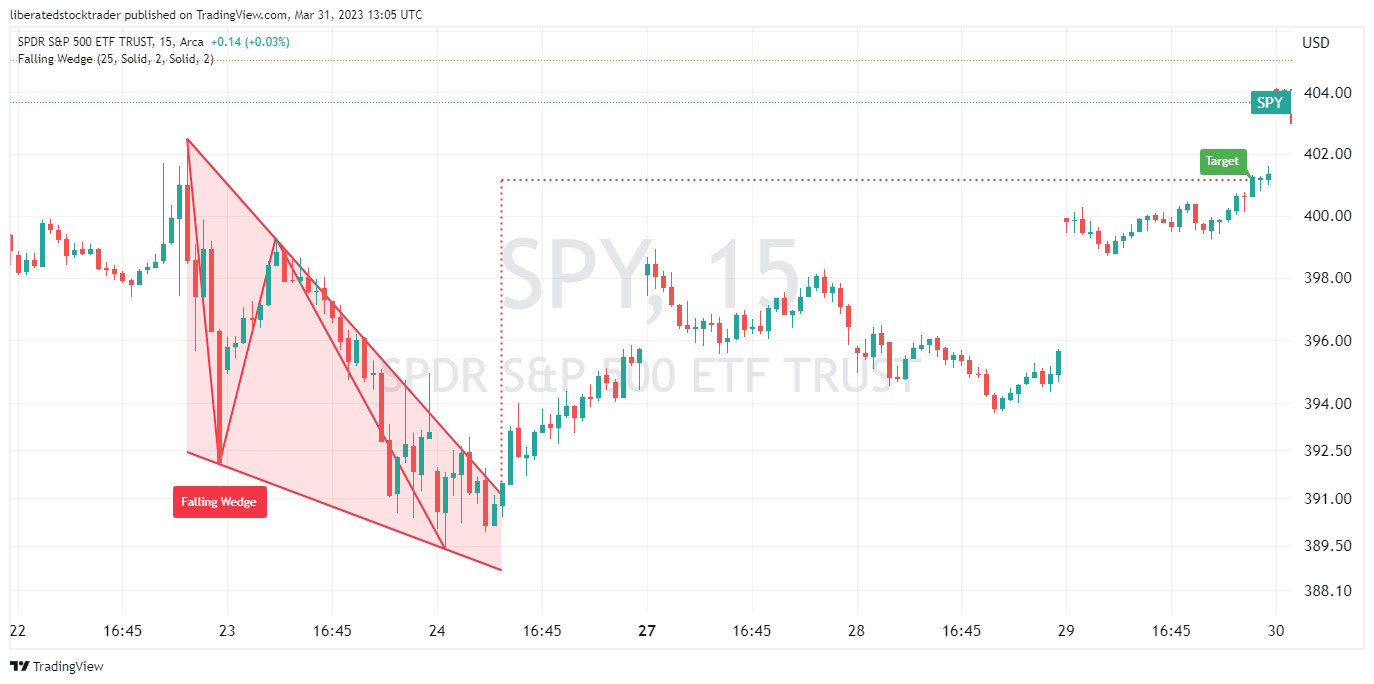
Identifying a Falling Wedge
To identify a Falling Wedge stock chart pattern, investors should look for two converging trendlines that form a descending triangle. The pattern should generally be visible on intraday and daily charts. After identifying the two trendlines, investors can look for confirmation of a trend reversal by watching for a breakout either above the upper resistance line or below the lower support line.
If the security price breaks out above the resistance line, it could signal that the security has completed its reversal. In contrast, a break below the support line could signal the continuation of the downtrend.
bearish pennant chart pattern for trading.Summary
Thanks to this research, we have proof chart patterns work. Each of these twelve reliable and profitable chart patterns has a greater than 80% chance of success with an average profit potential of 38% to 51%.
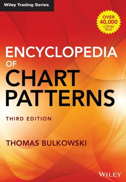
Believe it or not, there are chart patterns with even better success and profitability track records. Also, I have discussed only the success rate of these patterns in bull markets, but what about bear markets? All the research is revealed in Tom Bulkowski’s Encyclopedia of Chart Patterns. Incredible detail and a visual listing of these patterns are available at ThePatternSite.com.
FAQ
Do chart patterns really work?
Yes, chart patterns really work. According to decades of research, chart patterns work between 50 and 89 percent, depending on the pattern and the market. For example, a double bottom pattern in a bull market is predictive, with an accuracy of 88 percent and an average price change of +50 percent.
What are chart patterns?
Chart patterns are visualizations of market price moves created by supply and demand. These patterns identify potential price breakouts, reversals, and continuation moves. Chart patterns such as an ascending-triangle or head & shoulders are naturally formed by market buying and selling.
What is the most successful chart pattern?
How do I use chart patterns?
Chart patterns are used to identify potential trading opportunities. When a chart pattern is formed, you should watch closely for the pattern to break out. If the asset price breaks out through the resistance, it is a buy; if it breaks down through support, it is a sell.
How important are chart patterns?
Chart patterns are incredibly important for traders in stocks, foreign exchange, ETFs, and cryptocurrencies. Many traders use chart patterns but do not understand the probabilities of specific chart pattern success. For example, an ascending triangle has an 83 percent chance of success.
What is the most reliable pattern in trading?
According to decades of testing, one of the most reliable patterns in trading is the rectangle top, with an 85 percent chance of success and an average of 51 percent profit in a bull market. This pattern has been tested and documented in the Encyclopedia of Chart Patterns by Tom Bulkowski.
What is the psychology behind chart patterns?
Chart patterns reflect the psychology of market participants and how they perceive a security’s value. Chartists use these patterns to determine when buyers or sellers are in control, which can be used to identify potential reversals or breakouts. Chartists are looking for trends in price and volume that signify the current state of market sentiment.
How do you trade chart patterns?
Trading chart patterns is all about timing and spotting when the market turns. A trader should look for the signs of a pattern forming, such as volume spikes or narrowing price movements. Once a pattern has been identified, traders can execute trades based on their interpretation of the data.
How many chart patterns are there?
Which timeframe is best for chart patterns?
The best timeframes for chart patterns are 1 hour, 1 day, and 1 week. Research suggests that the longer the timeframe, the more reliable and accurate the chart pattern. Chart patterns on shorter timeframes from 1 to 10 minutes can be less accurate due to the outsize impact of larger trades.
Which chart pattern is most bullish?
Is pattern trading profitable?
Yes, pattern trading can be profitable when done properly. Pattern traders must recognize the pattern, wait for the breakout, understand the probability of success, and set a realistic target. These steps balance the risk (success probability) and reward (price target). These steps establish a solid framework for the trade.
Who invented chart patterns?
Why are stock charts effective?
Charts are an effective way to analyze and interpret data due to their visual nature. A chart can quickly convey a great deal of information in an easy-to-digest format, allowing traders to make decisions quickly and accurately. Furthermore, chart patterns often repeat themselves, so they can help predict future price movements once identified.
Why do patterns fail in trading?
Successful patterns fail in trading because market sentiment can change quickly. Even though a pattern is progressing perfectly, the impact of breaking financial news can disrupt the market and cause a pattern to fail. Even a successful pattern can fail if there is market-moving news, such as Federal Reserve interest hikes or an industry-impacting announcement.
Which trading style is most profitable?
Which trading strategy has the highest probability of success?
The trading strategy with the highest probability of success is based on sound principles such as risk management, position sizing, and proper selection of stocks. Applying these principles, traders can minimize losses and maximize returns. By following trends in the market and not trying to pick tops or bottoms, it’s possible to be successful.
Is there a perfect trading system?
No, there is no perfect trading system. Every trader has different risk tolerance and objectives, so the best trading system will depend on the individual’s goals. Furthermore, markets constantly change, and adaptability is key to successful trading. As Richard Dennis said, “The market is never wrong – opinions often are.”
What is the easiest pattern to trade?
The easiest pattern to trade is the rectangle or Darvas Box. This is a chart pattern where the stock makes a series of highs and lows within a boxed price range. When the stock breaks out of this range, it can signal either an uptrend or a downtrend. Experienced traders look for volume expansion when trading these patterns to confirm that the breakout is legitimate.
Which chart patterns are most reliable?
Some of the most reliable stock chart patterns do not occur often. The head and shoulders bottom has a reliability of 89 percent in a bull market, but it does not occur often. However, the double bottom chart pattern has a reliability of 88 percent and occurs regularly.
https://www.liberatedstocktrader.com/chart-patterns-reliable-profitable/”>
#Accurate #Chart #Patterns #Proven #Profitable #Reliable
